People Data Labs
Project type
Visual Design
Brand Design
Motion Design
Illustration
My role
People Data Labs’ brand was not scaling as the business grew. As the company evolved, the brand needed to evolve with it. Myself, along with the design team, pitched the idea of redesigning our logo and expanding our brand identity. The goal of our rebrand was to create an identity that is remarkable, credible, and unique.
Rebrand & Brand Expansion
Context
Background
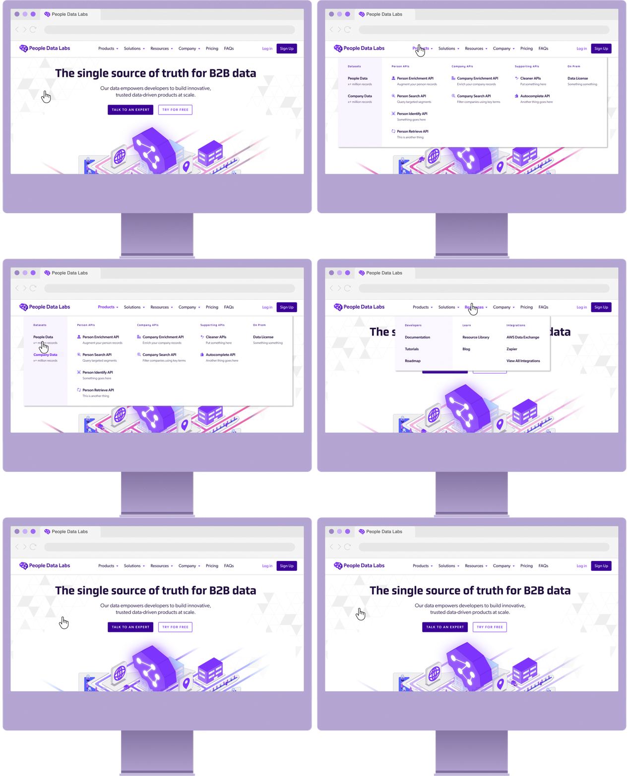
The design team embarked on an extensive competitor analysis and user research mission. Along with data from testing conducted by the product team, we used this information to inform our full rebrand and brand expansion. We reconsidered and developed from scratch every element, including our voice, typography, color palette, and logo. I also developed a formal style guide for illustration and motion, which was entirely new.
The Results
Logo
People Data Labs’ original icon was a brain, but it was a bit too complex to work well at small sizes. The brain logo mark is iconic for them and we wanted to honor it in this project. I re-worked the concept into a bolder, simpler mark that reads well across sizes and formats and can also, in specific situations, function on its own.
Color Palette
Purple had been the primary brand color for the People Data Labs brand since the beginning. We built a bold, bright palette of colors around the a purple hue, including gradients and tints that would be used in illustrations, infographics and data visualization.
Typography
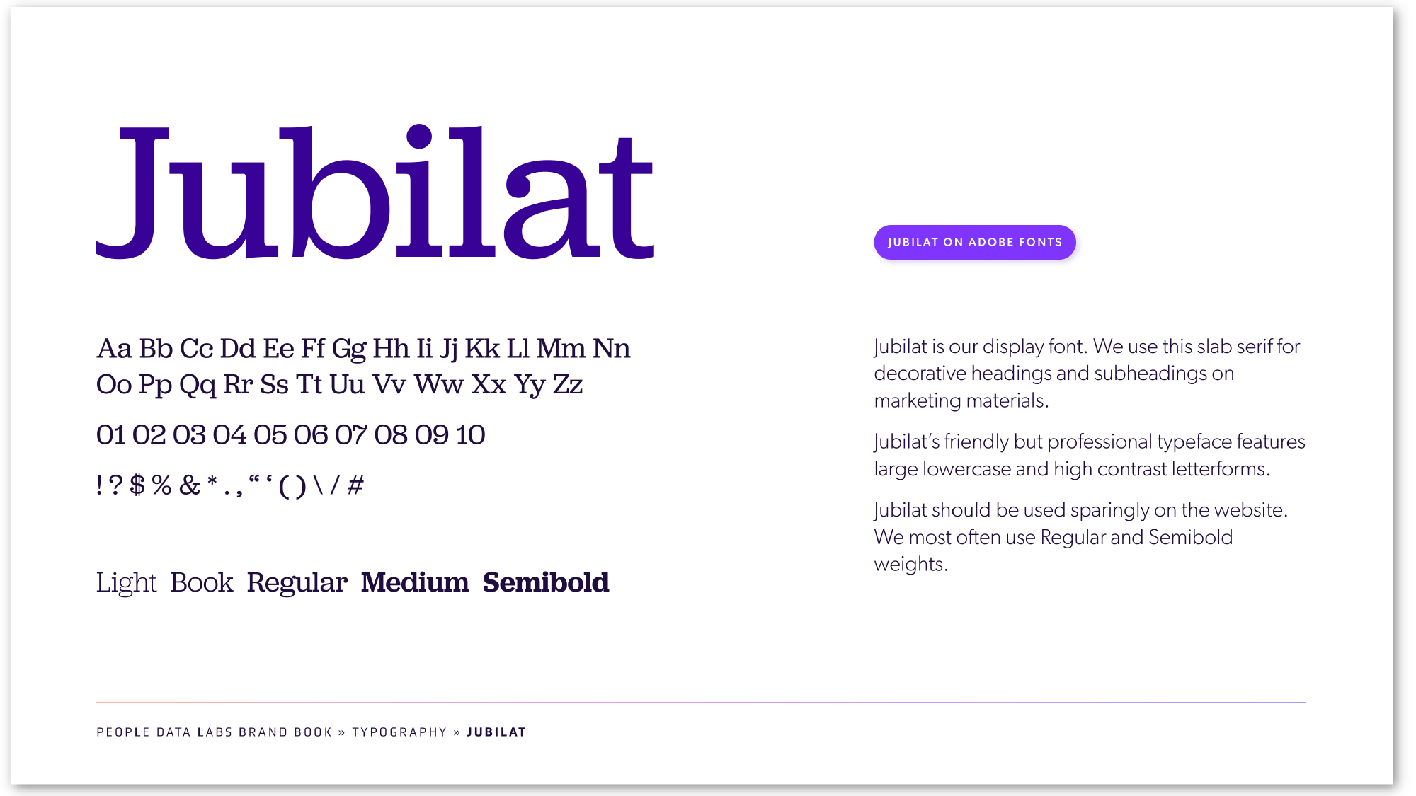
We chose Obvia, a contemporary, source-code-flavored font as the centerpiece to resonate with People Data Labs’ "For developers, by developers" principle. We added Jubilat for call-outs and Gibson for body copy. The fonts complement eachother to create an elegant, versatile typography kit.
Before I joined People Data Labs, they were using stock visuals for supporting graphics. For the rebrand, I created a custom illustration style guide, as well as a package of visuals and infographics that speak specifically to the People Data Labs products and features.
Illustration
Motion
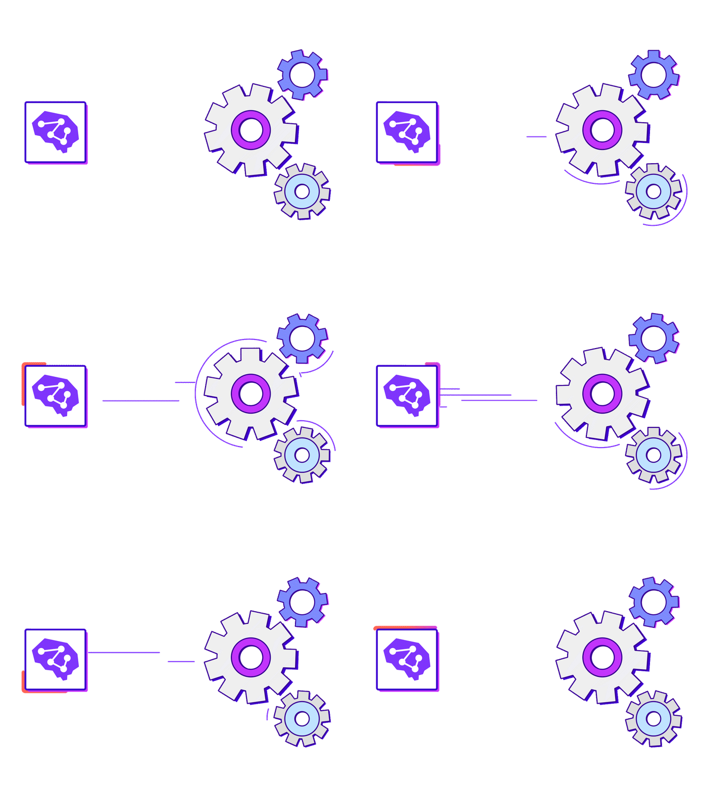
Motion is a brand new element to People Data Labs branding. I developed a motion simple and straight-forward style that can easily be used to animate the new custom illustrations and add dynamic elements to basic designs. We started implementing motion across our marketing strategy with product explainer videos.
Iconography
I developed two different styles and sets of icons: One for the dashboard, designed to read at very small sizes. And one for use in collateral, landing pages/web pages, and email. This set is more intricate and highlights product features, use cases and other important concepts.


